Before we went to America the kind people at Microsoft lent me a brand new Lumia phone to trial. I was given the Lumia 830. So, as a long-time iPhone user, what did I think? Here’s the science bit (i.e. from the website).
What impressed me?
The camera – far better than the iPhone alternatives, this is the real selling point of the phone and what I used it for predominantly. I instagrammed my way around Boston and Maine with my Lumia and it really captured some good scenes. My husband used the DSLR and I used the phone – our album of favourite photos is a mixture of the two, whilst perhaps not large enough photos for big reproductions, they have real clarity and are true in their colour and depth of field and the camera is truly wide angle.
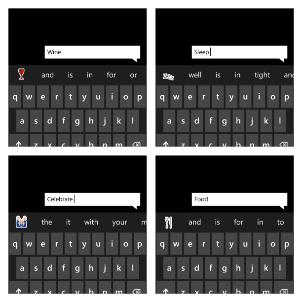
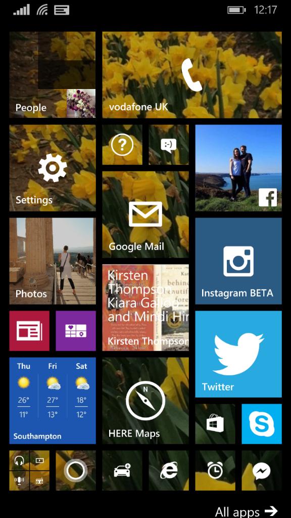
Clever text messages – whilst I can be fussy, it is often the little things that please me most. This is clever. I don’t use emoticons much apart from smiley and sad faces, but type a certain word and up pops a little picture that you can use instead or as well. The operating system – for two reasons. Firstly the way that it can remember what you were doing last, there is a back button which is very useful and takes you between apps in the order you just used them, as well as through pages used too. Secondly – it just seems to operate more stably and intelligently – whether it is just because it is different to iOS or perhaps because it is based on the computing methods I’ve grown up. No matter – both are very intuitive and I didn’t open the instruction manual once despite how different it is to what I use day to day.Personalisation – particularly clever – you can optimise your home screen to suit your needs. Not all apps need to show (there is a menu for the others) and different sizes are possible depending on your preference. As you can see my screen was set up for what I used the most and it became very easy as a result, not having to skim through different screens.
What could have been better?Size – it is a big phone and so didn’t really fit in my pocket. That said – it was very sleek (apart from its orange back!!) and so didn’t look ugly despite the size, and it’s not like there isn’t a choice of sizes of handset.
Apps – sadly the apps aren’t all as up to date as the iOS ones that I am familiar with on my Apple products. Instagram annoyed me as the choice of editing functions just isn’t available. Another twitter user did however tell me about 6-tag which is an independent app that does much of what a more modern instagram can do. Generally the apps are behind where they should be and given the amount of time we spend on our phones using apps I think this is an area that really needs focus on.
In conclusionIt is almost the full package – great camera, really user-friendly set up and operating system. A clear winner in those areas. Once the apps are being updated to keep pace with other operating systems then I think these phones will come into their own. I was sad to see it go – I very quickly got used to how it worked and the quality and feel of the phone.


I like your wide angle shots and the fact that you can personalize the home screen
Suze | LuxuryColumnist
Author
A great camera – it was nice to not need a posh camera to catch the view!